
Colors
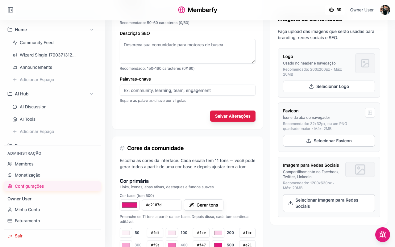
The community's primary and secondary colors, each with 11 shades generated from a base color and adjustable one by one, the preview, the contrast warning and how to go back to the default.
Every community has its own colors, and they paint the whole interface for every member: buttons, links, tabs, highlights.
What they're for
To make the community look like yours: the school in its brand orange, the coworking space in the green of its storefront, the company in the blue from its brand guide.
How it works
The two scales
| Scale | Where it shows |
|---|---|
| Primary color | "Links, icons, active tabs, highlights and soft backgrounds." |
| Secondary color | "The main action buttons." |
Each scale has 11 shades, from 50 (the lightest) to 950 (the darkest). Shade 500 is the base color. The shades the interface uses today are highlighted; the others complete the scale.
Generate shades
Generate shades "Fills all 11 shades from the base color. Every shade stays editable afterwards." It's a shortcut: you can fine-tune each shade later.
Contrast
Some shades are used as a background for white text. If one of them is too light, Low contrast appears: "These shades are used as a background for white text and fall below the 4.5:1 minimum ratio." The Darken automatically button fixes it. Even if you don't fix it, the button text color is recalculated so it stays readable.
Preview
The Preview shows the Main action, the Create button, the Active tab and a Highlight in the colors you picked, before you save.
Back to the default
Restore default brings back the original colors, once you save.
Who can
The owner and admins.
Step by step
Role: owner or admin.
- Settings › General › Community colors.
- In Primary color › Base color (shade 500), pick the color (or type its code, like
#e2187d). - Generate shades.
- Repeat under Secondary color.
- If Low contrast appears, click Darken automatically.
- Check the Preview and Save Changes.
Examples
A school in orange. Primary #FD7A05 (links and tabs), secondary #C2410C (buttons, a darker orange so white text stays readable).
A company in blue. Primary #2563EB, secondary #1E3A8A.
Tips
- Use your brand color as the primary and a darker version of it as the secondary.
- Avoid very light secondary colors: buttons have white text.
- Check the community on your phone after saving.
Common errors and how to fix them
| Situation | What to do |
|---|---|
| The buttons became unreadable | Darken automatically, or pick a darker secondary |
| I changed it and nothing happened | You didn't click Save Changes |
| I want the original colors | Restore default and save |
Frequently asked questions
Can each member choose the colors? No. The colors belong to the community.
Is there a dark mode? There is no dark mode in the community.